|
|
|

The oldest are at the top and the newest are at the bottom. ^^;;
HKU Layouts Never again to be updated

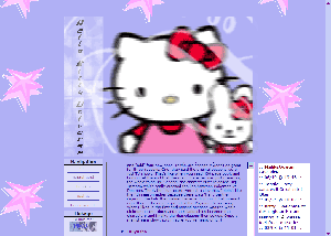
used from August 8, 2003 to August 12, 2003
Description: I was inpired to use Hello Kitty, copyright sanrio. This is my first attempt with
Iframes and DIV layers. I was going for the girly colors. It was nice, but I easily got bored with it.
used from August 12, 2003 to September 01, 2003
Description: This one lasted a long time because I wasn't really in the updating mood for quite a while.
It was a nice layout, though it was also rather boring. The girl in the layout image was drawn by me, which
was my imspiration.
used from September 01, 2003 to September 21, 2003
Description: This one also lasted quite a while. It wasn't very nice in my opinion, at one of my
least favorites. My updates slowed for a long while around this time, which was also a reason it wasn't
changed quickly. It featured Chi from Chobits, but the way I made the layout image, she was hidden. Yucky.
used from September 21, 2003 to September 28, 2003
Description: This layout changed my style of design considerably. I got rid of the usual ME, YOU, SITE, WW sections
and made up an array of weird sections (HISTORY, PERSON, CULTURE, DATA, OBSESS). The layout was also
abstract and weird. I don't like it a lot and probably will change it after a while. There isn't
really a layout image, but that SUPER HELLO KITTY image was written by Jessie and I scanned and colored it.
The smoky grid images are quite a centerpiece, and I learned how to make them at Violette Designs.
Thanks Violette!
used from September 28, 2003 to November 7, 2003
Description: Again, a way different layout but much simpler. It has a short
loading time and is was so very simple to make. :) It does the job nicely
and is very cute. But I'm was ready for a new change...
Ching-Ching
Temp. Version
Used from from November 7, 2003 to November 16, 2003*
Screenshot Lost
Description: I used simple "table illusion" background with a scrollbar-less
iframes. The really neat thing was the SPAN down links that I learned.
I used on of Yurin's images, she's really talented; unlike some I could mention.
* (?) Guesstimate
Version 1 "School Paper"
Used from from November 16, 2003* to November 24, 2003

Description: My very first horizontal layout. It doesn't have a real name, but
I call it "School Paper". See the background is supposed to look like
lined paper and those horizontal images are index cards :) I really like the
look, it's clean and fresh looking. A great new start.
* (?) Guesstimate
Version 2 "Winter Screen"
Used from from November 24, 2003* to December 3, 2003

Description: Another simple and rather pretty layout for my transaction
stage :) It worked beautifully and was very simple.
Version 3 "me and my clarinet"
Used from from December 3, 2003 to December 14, 2003

Description: A more complex layout. It features a (doh!) clarinet and
some pretty junk. I did not appreciate the fact that I made it
the damned wrong size. Lasted a little longer than one would think.
Version 4 EXPLODE
Used from from December 14, 2003 to December 15, 2003

Description: Called EXPLODE because I simply took all the things I wanted
and put it into one stupid layout. It is a stupid layout, I think my brain
exploded.
Version 5 no name
Used from from December 15, 2003 to January 14, 2003

Description: Lovely layout! Read all that copyright junk that appears
under everything :) Anyways, I completely love this layout, I think it will
stay up long past Christmas. Maybe all of winter! :) It's simple, yet
implements some new things I've been dying to try out. [edit] It
didn't last all winter, but it certainly lasted for a while.[/edit]
Version 6 no name
Used from from January 14, 2003 to January 28, 2003

Description: I had to make a new one. I loved the old one, but I just
needed a change. This one looked suspiciously like the old one, which
is very true. I liked it, but only because I started testing out new
bold texts using CSS. I liked it, but I wasn't that happy with
it to be honest.
Version 7 no name
current
Description: After all of my attempts to make a "fancy" layout, that
was still simple I gave up. This layout is not fancy. It is simple
and that is that. I especially love the buttons I made for navigation:
They are so small and cute. Minimalistic, yet functional. Yay!